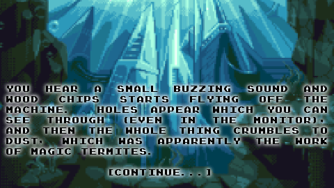
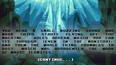
Well this was a doozy. A good exercise in minimalist thinking. Because of the end resolution of my game, I had to fit the words onto pages with a certain amount of lines. While I could do more pages, Doing too many pages just extends the game without adding anything to it. But when squeezing the text down to a certain number of lines I had to cut out a lot of text I wrote initially. So it loses some flavor of the “drama” or story I was trying to put into it. But hopefully these restrictions make for a better experience.
I split up most of the pages into two, and added a few things. At the same time I created the text overlays in gimp, since Sausage doesn’t actually do in-engine text overlays yet. It took ages and was as boring as heck. In fact I’m not even sure this is worth finishing. It’s only pong after all, and it’s stupid. I just thought it would be funny, and it turned into drudgery. In any case I haven’t quit yet.
So now without further ado, I present the final Twine version.
Pong Adventure – Final twine version
Did I mention it’s got 31 different endings. Only one “winning” ending? Extra points if you find the really goofy ending. (Actually it’s not that the ending is more goofy than the rest of them, but the way to get there is goofier than the rest).
Quick Update: October 24th — More mockups.
I’m trying to figure out a proper layout for the text over the images. The images are going to be a quarter size of the actual screen res of 480×270 — however I’m either going to A) put the image (like in a previous post) upper middle, or I’m going to scale it to fit the full size. The point is to make the text readable, so I added a little bit of background to the letters — Let me know what you think, or if you have any other suggestions?
Please note the pixel art is not mine, and will not be in the final game — I just did a screen cap of a web page real quick to see how text would look against it. It’s sufficiently complicated enough that I shouldn’t have any problem seeing the text if it works with this.


Two more with a single pixel outline.


Here I actually swapped to white text on black outline — single pixel


same white text 2 pixel black outline


Finally back to black on white, but with the 2 pixel outline.


Update Friday October 25th –
Okay well this is the last of the test version of the images. After all that’s said and done, I liked the white text on black background (outline) — but it doesn’t look that good over completely white or extremely bright. So I came up with a solution, that includes a 1 pixel outline in gray around the white text and then the 1 pixel black outline. It makes it look less weird on white and still is really readable. I might change my mind when I put in the actual art but in the mean time here’s what i’m talking about:


Here’s a final, which I might go with over the others —

Okay so there are two more… I like these even more than the rest of it… it avoids the sort of “sub-pixel” effect or the blurriness of the image with the single black around a single gray around white text, but still has that readability… Reversing the black and gray outlines causes you to still read the white text properly… you sort of ignore the gray outline. Since it’s gray it doesn’t look as weird as a white outline would be around the edges… Since I couldn’t get a great general consensus I think I’m going to stick with this one (unless I have tons of people telling me not to) — now the only question, little image or blown up image… let me know –


— one more 😛

Okay this is the last one i swear!


